Main UI & Nav Controls
The challenges with XAML learnings are now completed, and I can continue building the app from this point with more confidence. The main things I needed to get right as early as possible were the use of custom controls to generate screens, as well as app routing to allow the same sort of nav and interaction methods as used on desktop (versus the usual flyout or tab navigation seen in template apps).

Trial and error, as well as a little more experience coding across different platforms, is paying off now. This is helped by the use of the same main languages across these platforms.
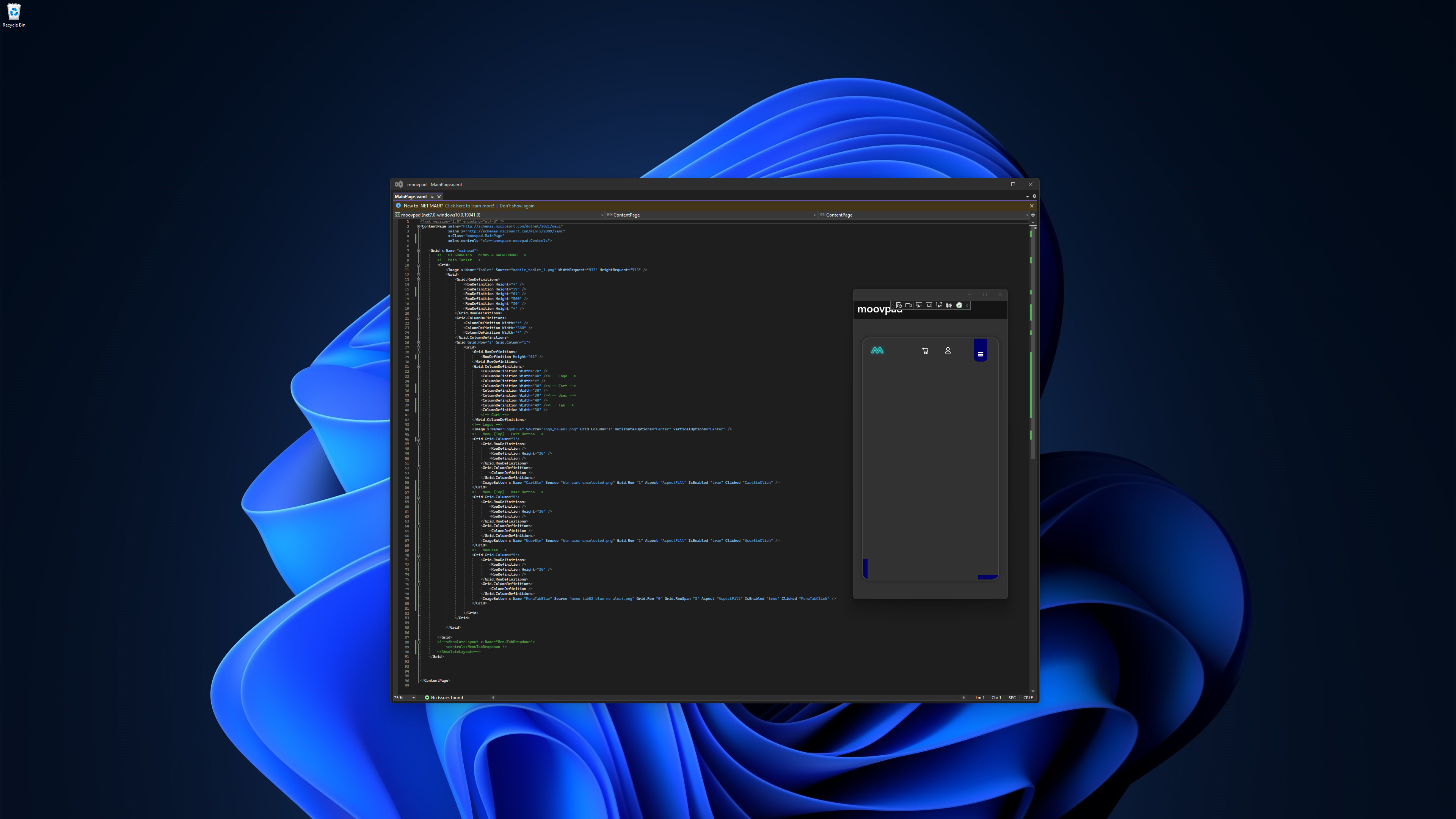
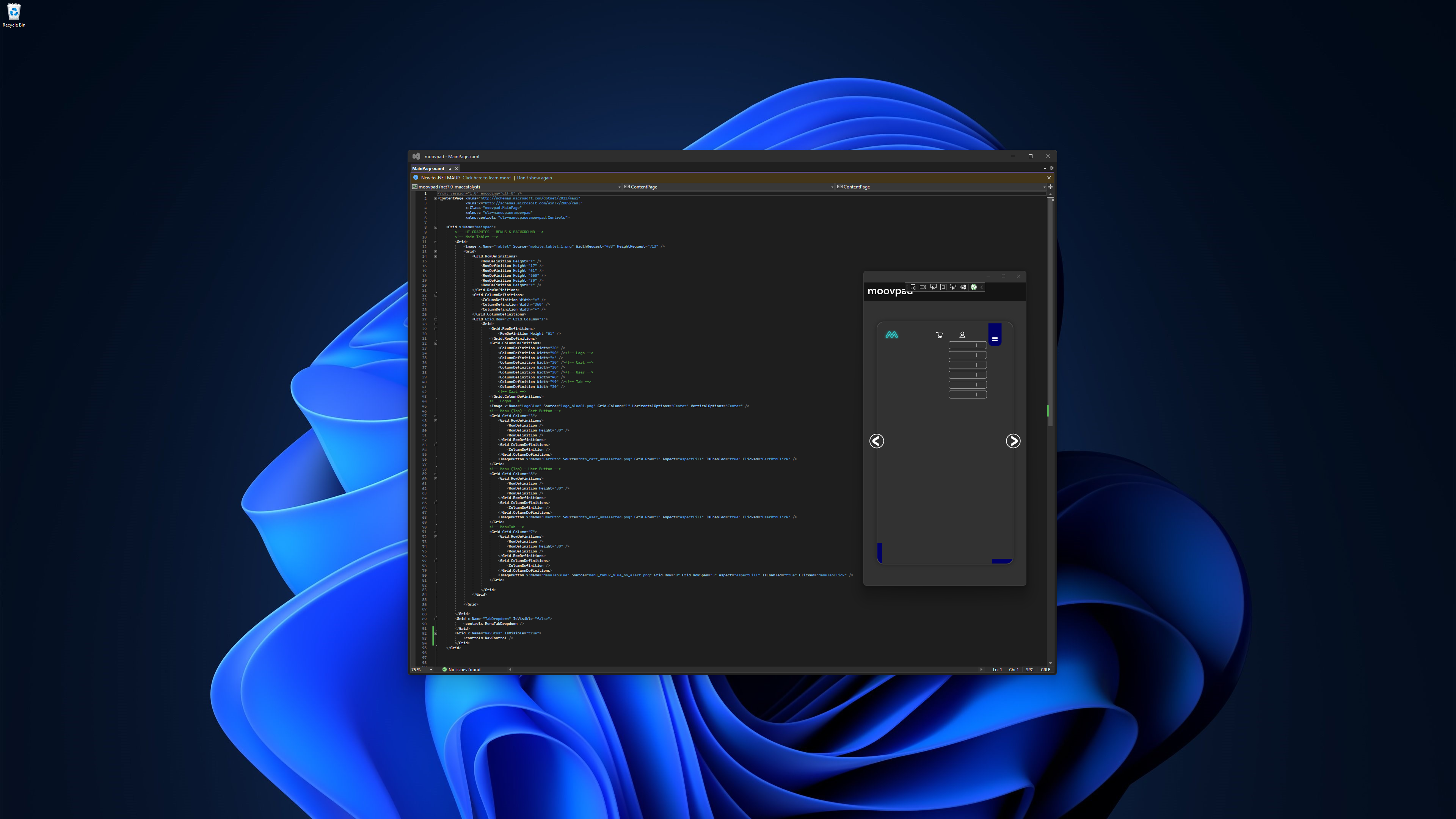
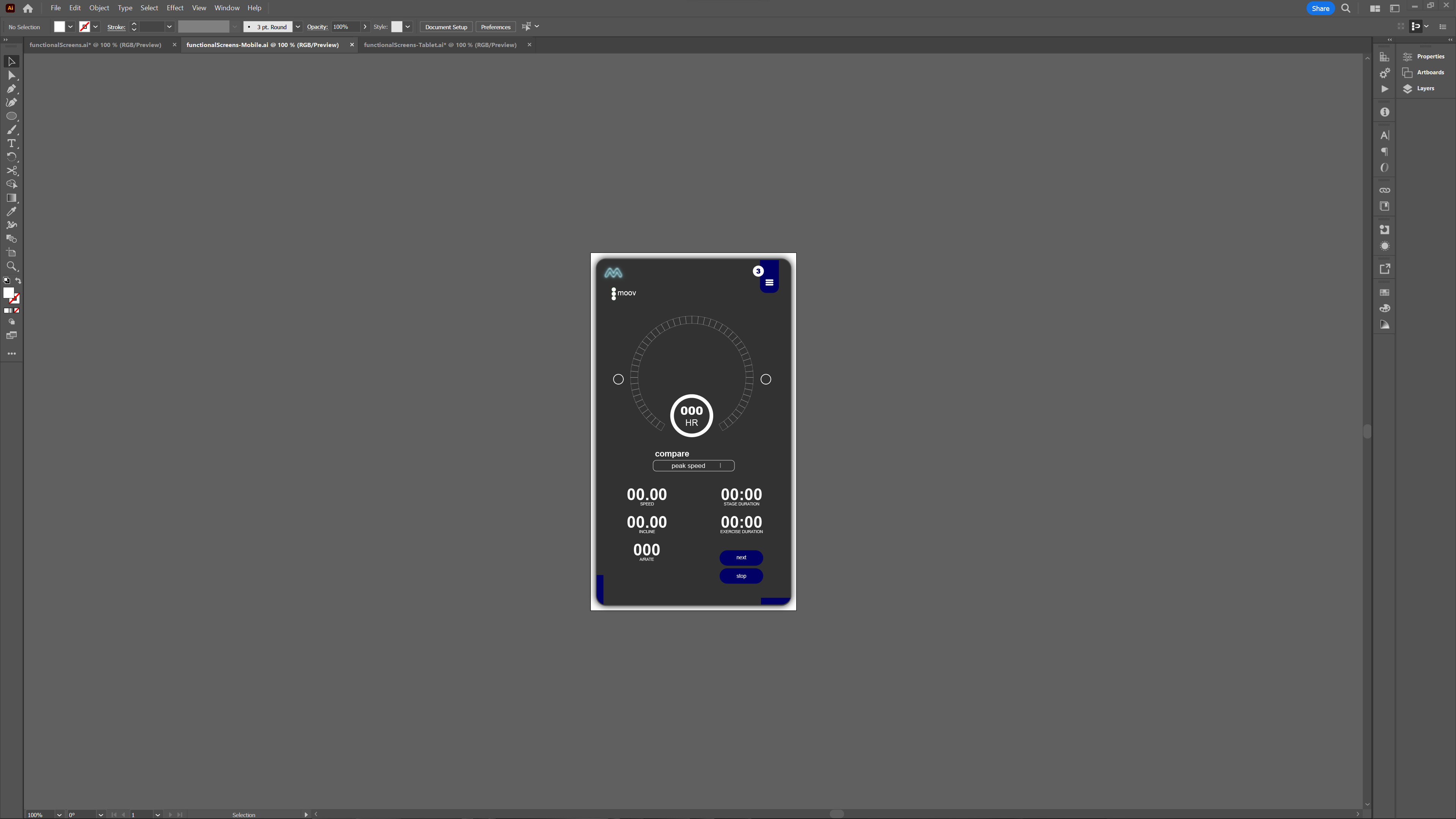
The screenshots above show the main UI now in place and working well. The tab menu at the top is functional (although I'll be updating the button images as for the desktop version), as well as the nav buttons on the sides for moving between screens already opened by the user (I'll shrink those a bit too).
Work can now begin with the building of the main functional screens of the app as their own independent controls 🙂
Stay awesome,
EMH

HOW MOOVPAD IS BEING BUILT
For the overview of how MOOVPAD apps are being developed, the reasoning behind particular decisions during development, policies, links to the science and research at the core of MOOVPAD, and more in relation to all the technical things, please see the link to the left.
This will be an ongoing work in progress, and will always be linked to the bottom of each upcoming Blog post.
