Sample Assessment UI Screens
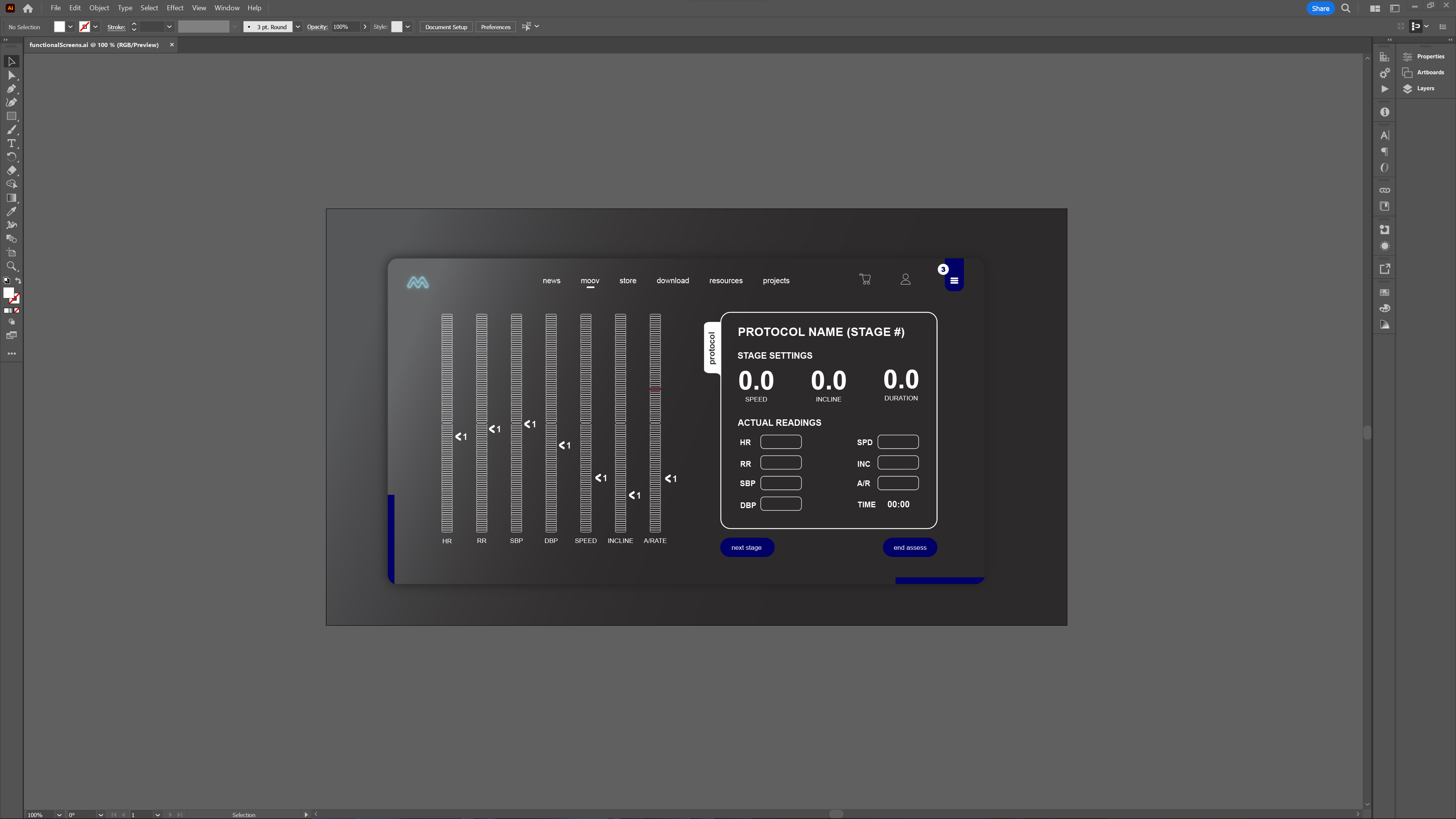
Another busy day of design and planning, with more still to be done. In the screenshots here, we see some samples of planned PAPE assessment screens. The first image to the left is an example view for data entry. Although the main purpose of these assessments is to provide technical feedback to users on performance, meaning they are mainly aimed for use by professionals, they should also be available for general use in some cases/modules of the MOOVPAD apps.
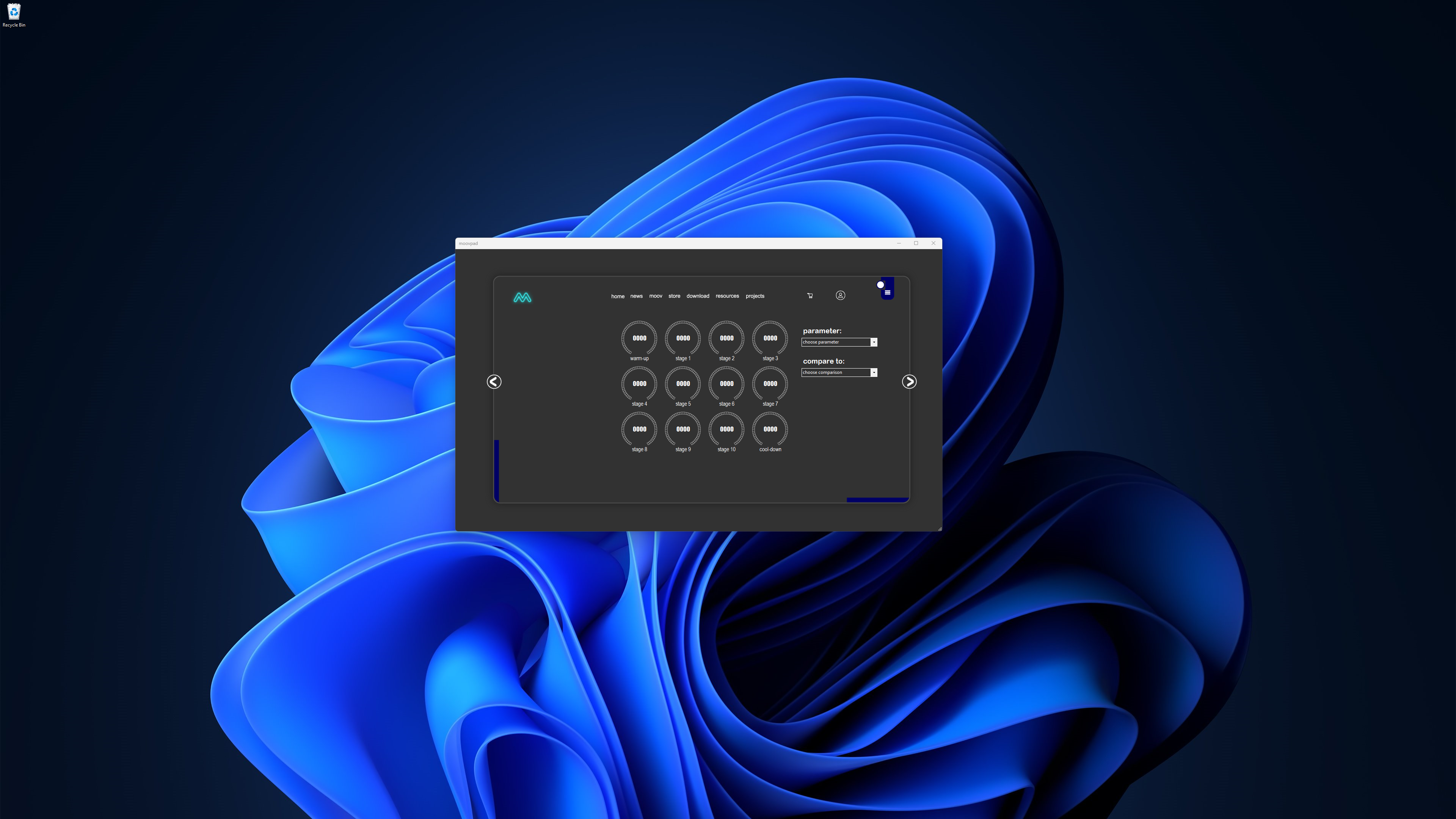
There are also many options available for potential UI screen layouts and metrics when it comes to final assessment results and reporting. For example, the image to the right shows the UI screen that has already been built for displaying MOOV results at the end of an aerobic session. A similar concept may be used for some cases where the data to be entered is not as detailed or the result summary required does not need to cover the full set of usual assessment parameters.


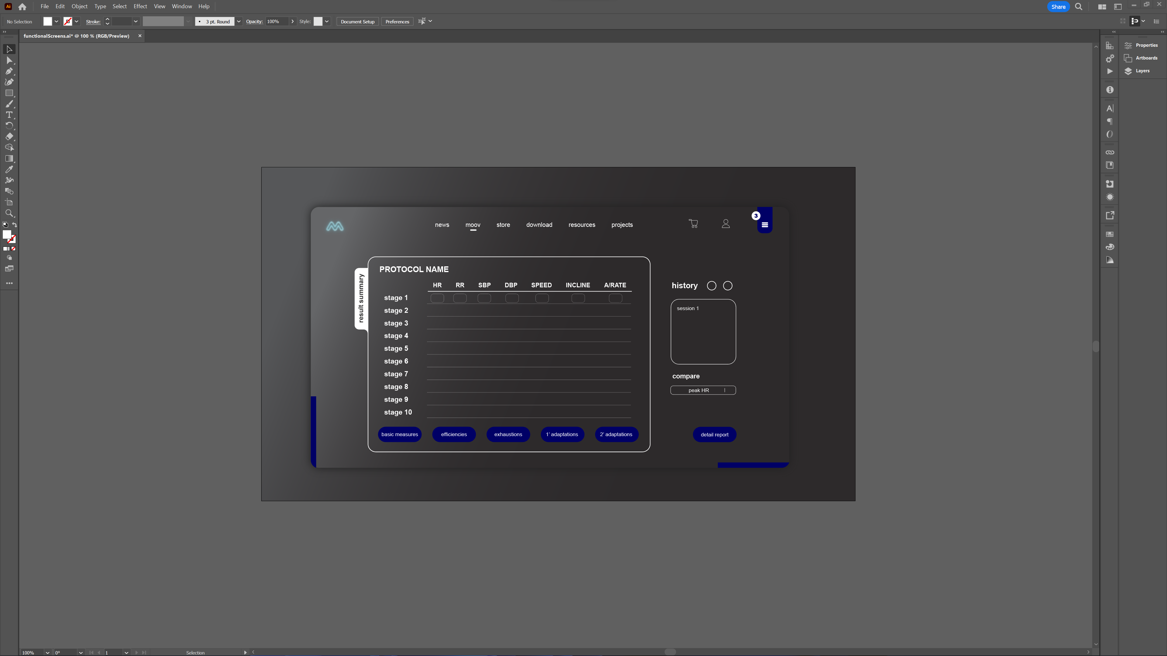
However it is also possible to develop more detailed reporting screens such as that shown in the final image to the left. Using a table layout like this will likely be more relevant to professional users administering the assessments to their clients, as the intention is to provide comparisons on some of the more technical aspects of physiologic assessments.
Hope you guys have a great few days ahead, and I look forward to catching up again soon 🙂
Stay awesome,
EMH
HOW MOOVPAD IS BEING BUILT
For the overview of how MOOVPAD apps are being developed, the reasoning behind particular decisions during development, policies, links to the science and research at the core of MOOVPAD, and more in relation to all the technical things, please see the link to the left.
This will be an ongoing work in progress, and will always be linked to the bottom of each upcoming Blog post.
