Uniformity Across Apps
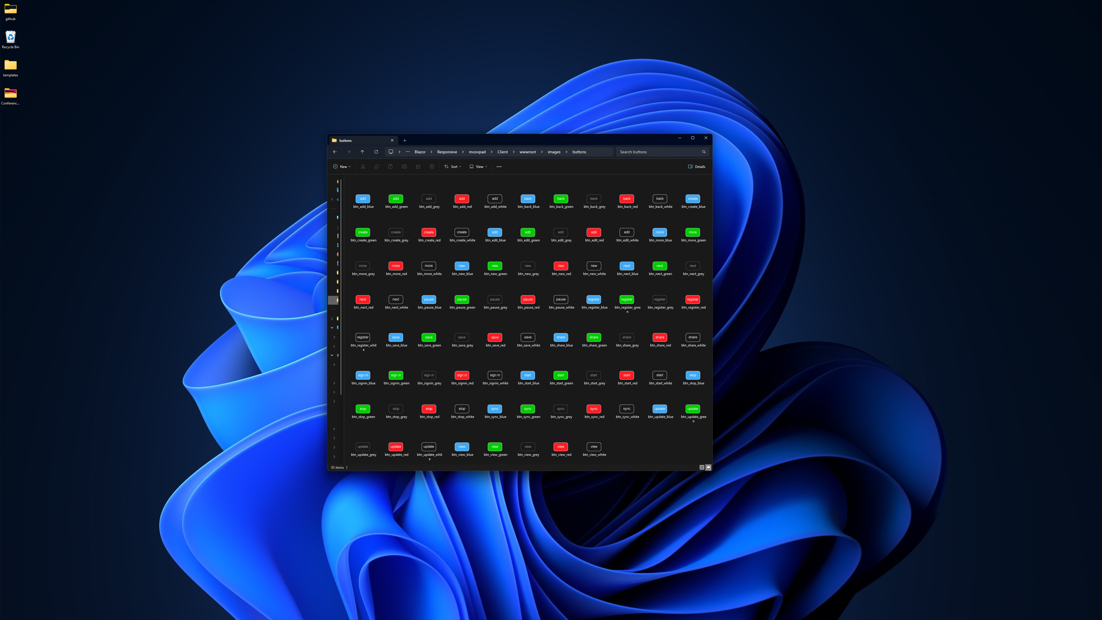
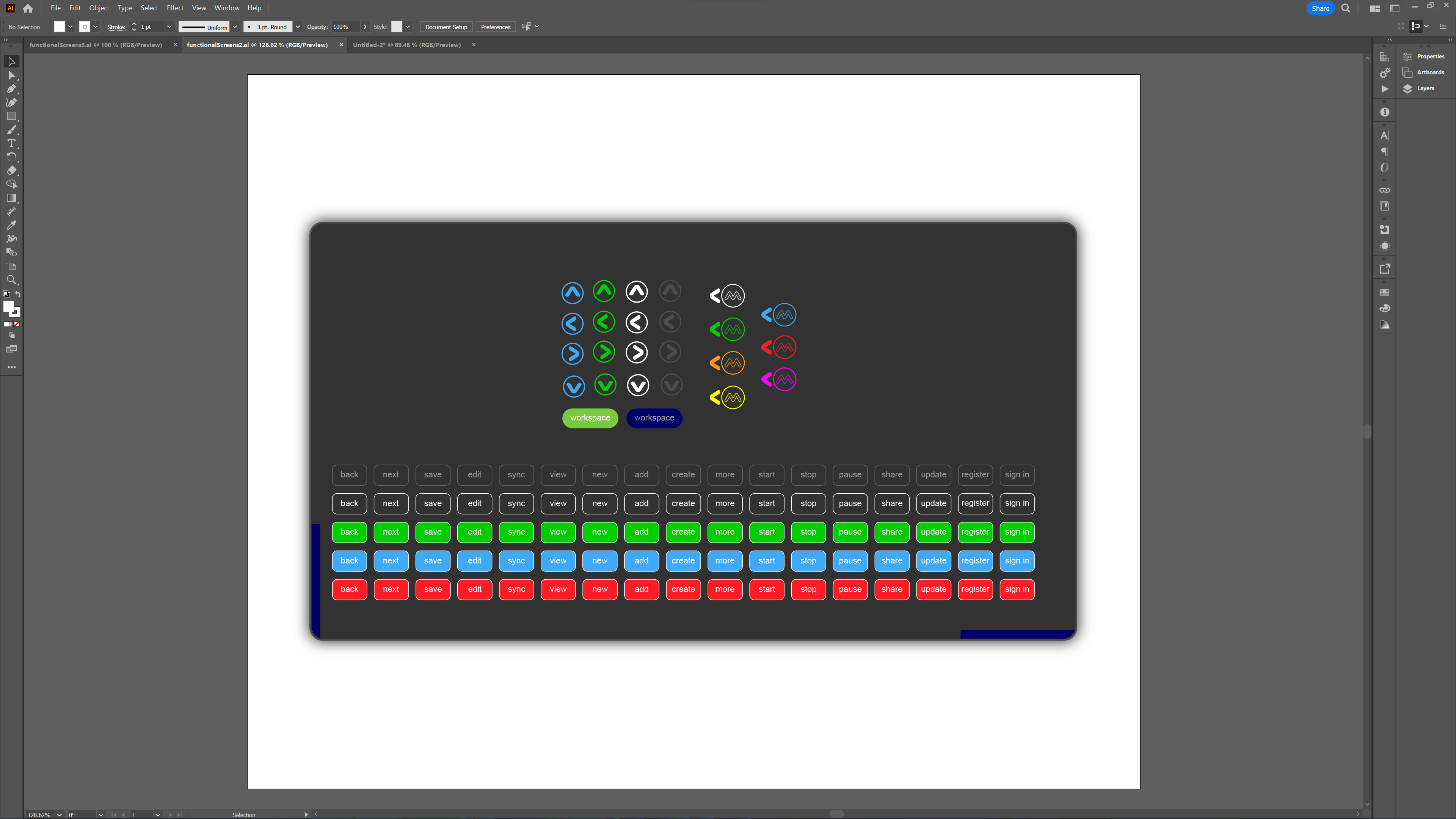
The screenshots to the left and below (larger image) show the standardised buttons that I'll now be using across all of the MOOVPAD apps. By using the same graphic elements this way, I believe consistency will be improved not just visually as perceived by the user, but also functionally in terms of the UI and UI Interop code.
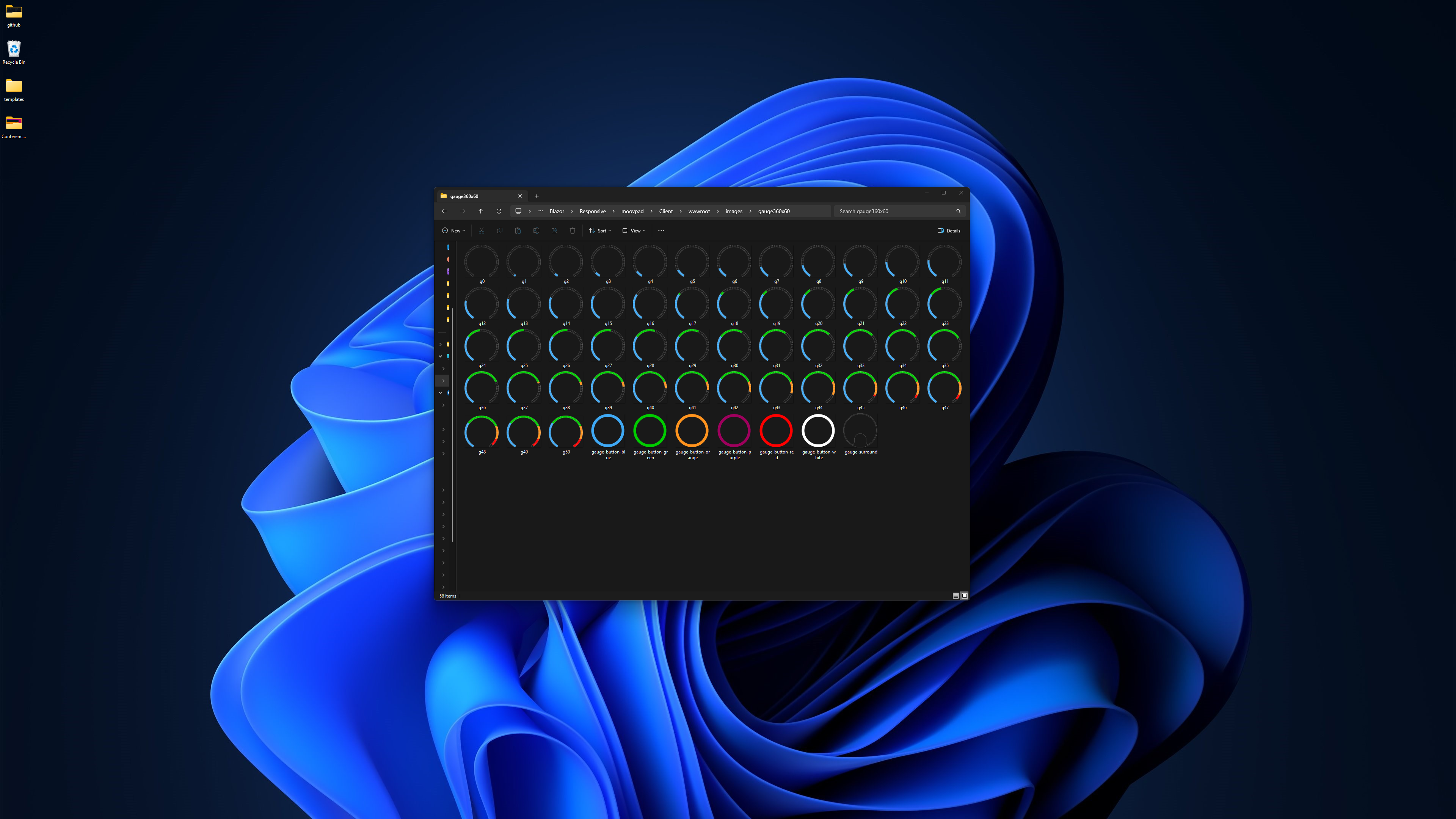
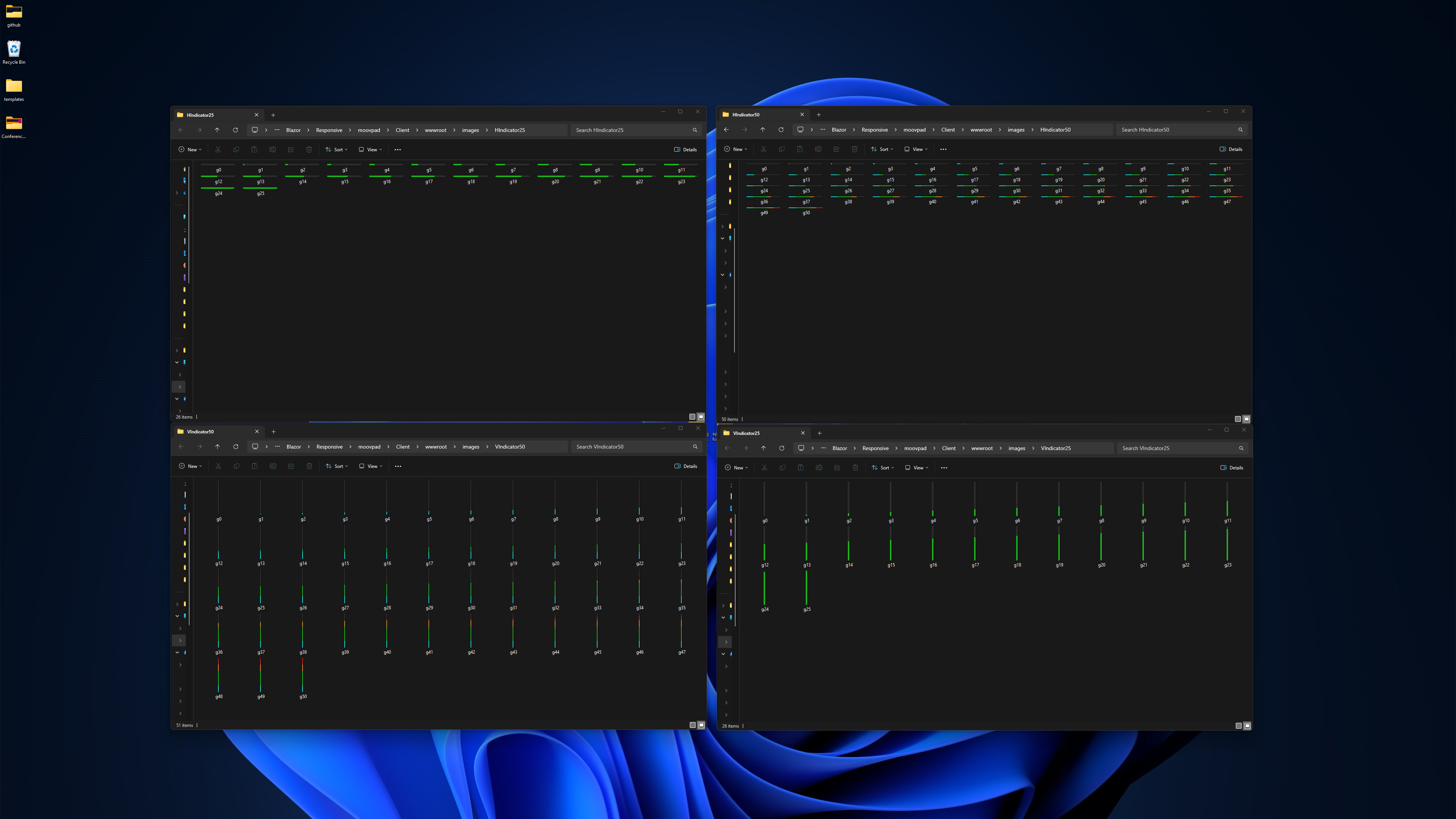
This is particularly true for the gauges, progress and status indicators, as well as charting. All MOOVPAD apps will use these elements to some extent, applied in similar ways. And so the processing code can also be improved during the current refactoring to simplify all of that processing later for the other apps in the suite. Note: I'm using the "btn_name_colour" file names because the use of capital letters doesn't work well for MAUI/Android.
But I may also just be graphically and mentally insane lol 🙂
Stay awesome,
EMH
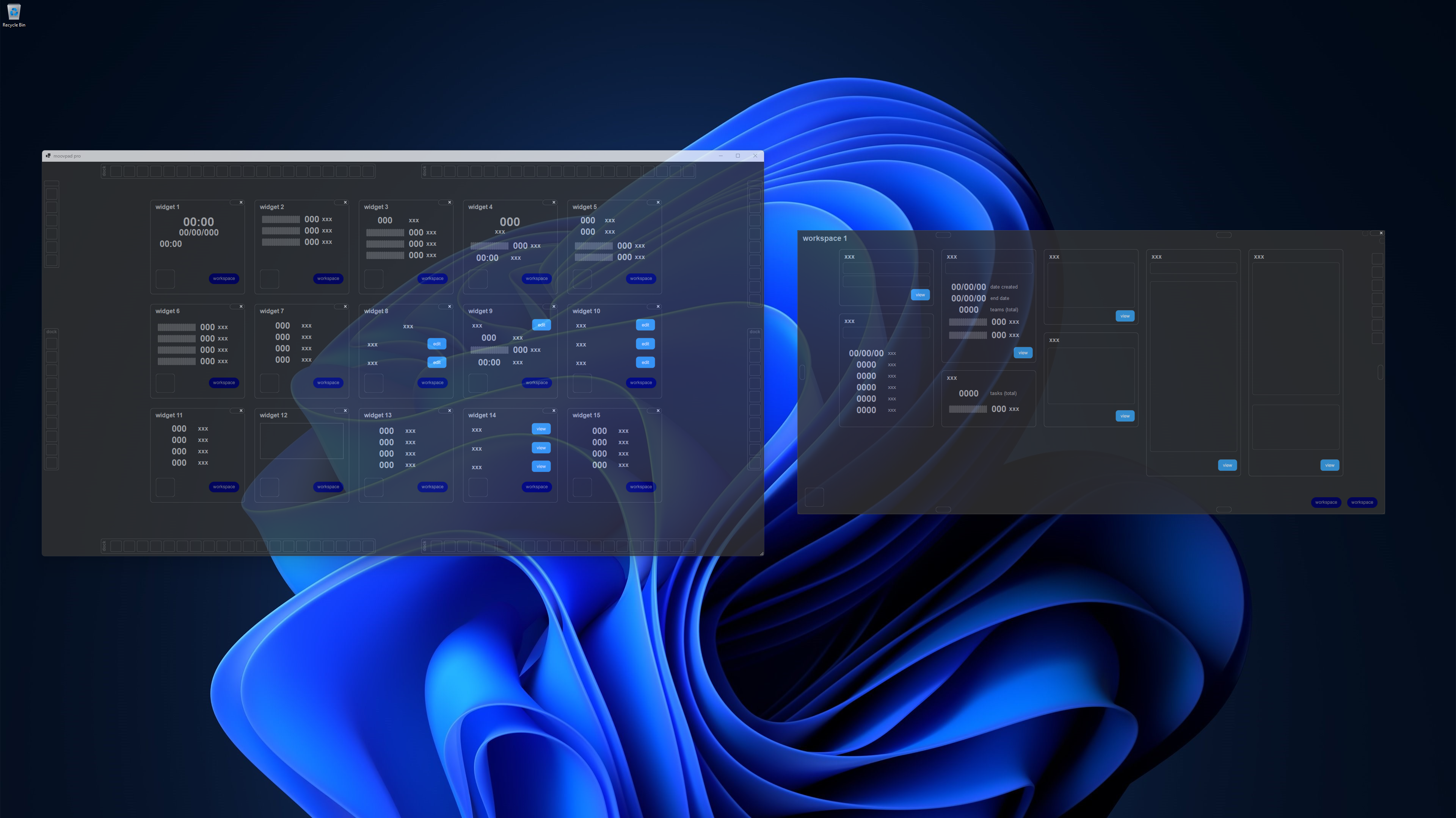
HOW MOOVPAD IS BEING BUILT
For the overview of how MOOVPAD apps are being developed, the reasoning behind particular decisions during development, policies, and more in relation to all the technical things, please see the link to the left.
This will be an ongoing work in progress, and will always be linked to the bottom of each upcoming Blog post.
