Window Resizing & Multi-Format
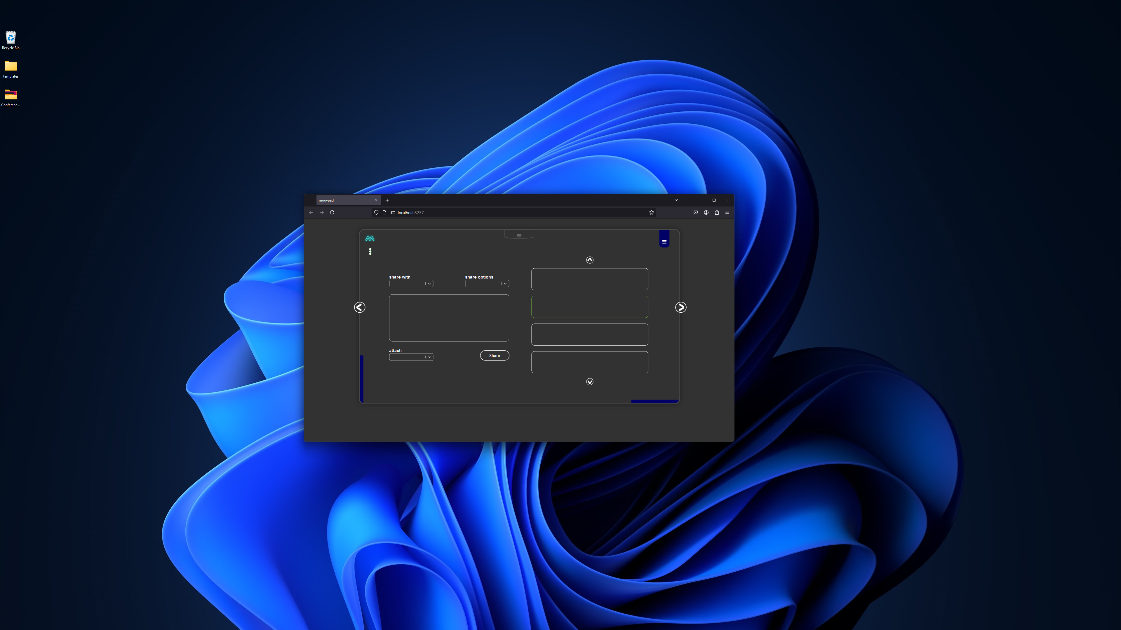
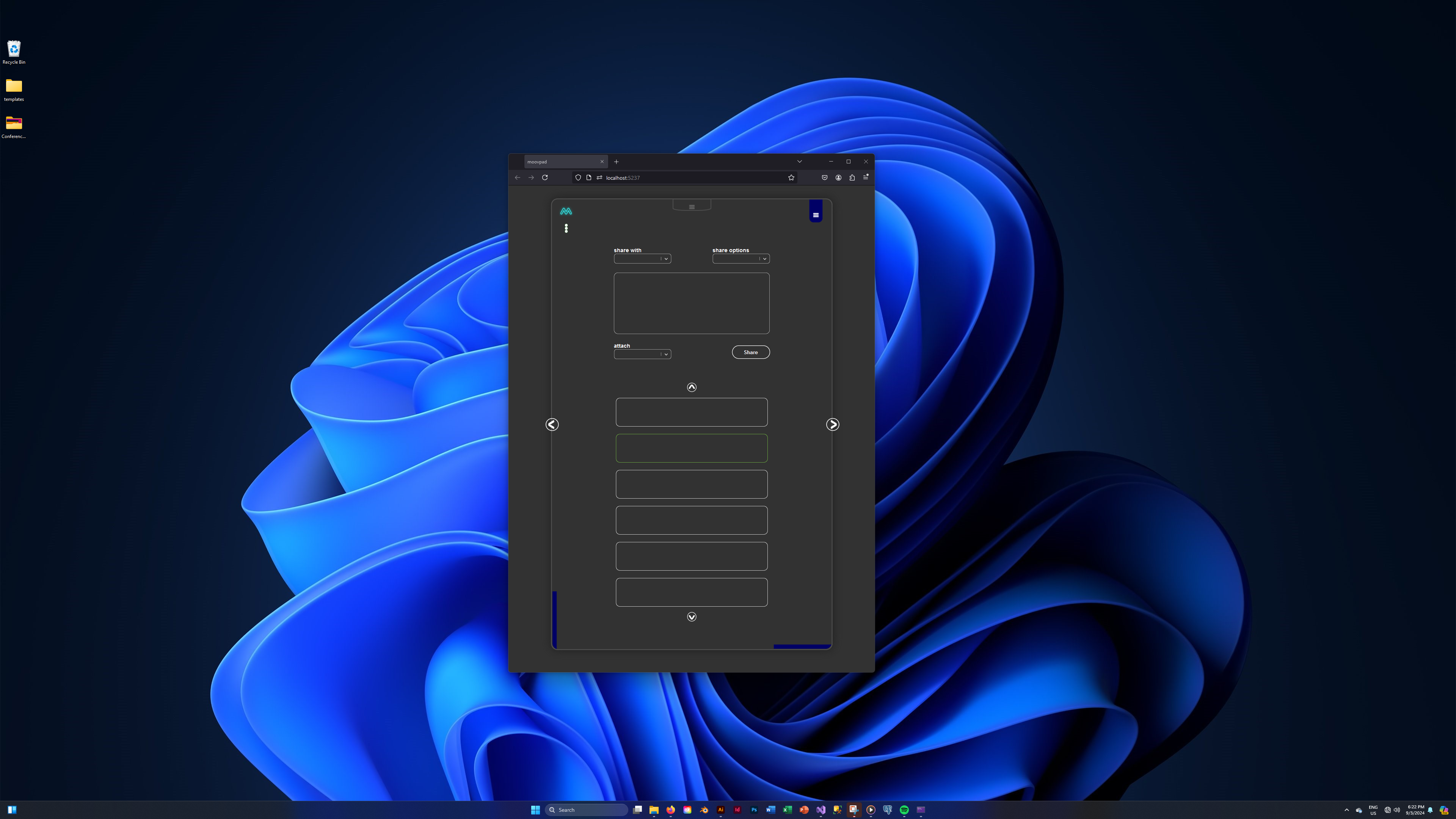
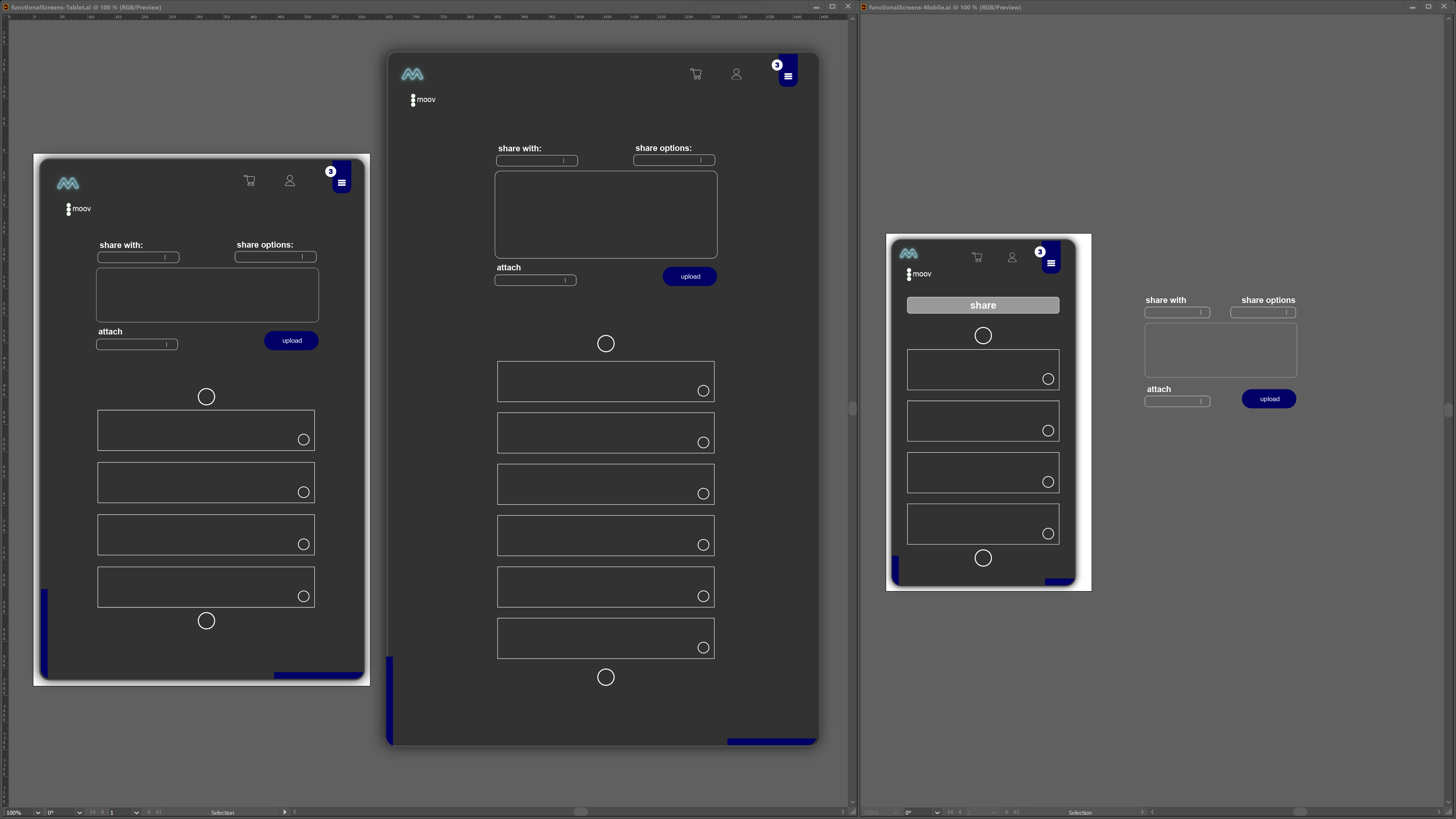
Although the nav functions for the MOOVPAD Web App are all working fine, the next task will be to get the window resize function to properly recognise that a change has occurred in the screen display format (e.g. from desktop to tablet mode), and then reformat the screen appropriately based on not just the overall elements, but the specific configuration of these.

So the number of items shown in the scroller is a good demo for this. In switching between four items on desktop, to six on large tablets, then down to four again on smaller tablets and smartphones. Once that task is done, I can then focus on the actual scrolling of items through the scroller. But one step at a time for now.
Yep... sounded simple to me too at first. Ikr... E 🙂
Stay awesome,
EMH

HOW MOOVPAD IS BEING BUILT
For the overview of how MOOVPAD apps are being developed, the reasoning behind particular decisions during development, policies, and more in relation to all the technical things, please see the link to the left.
This will be an ongoing work in progress, and will always be linked to the bottom of each upcoming Blog post.
