Formats & UI Mechanics
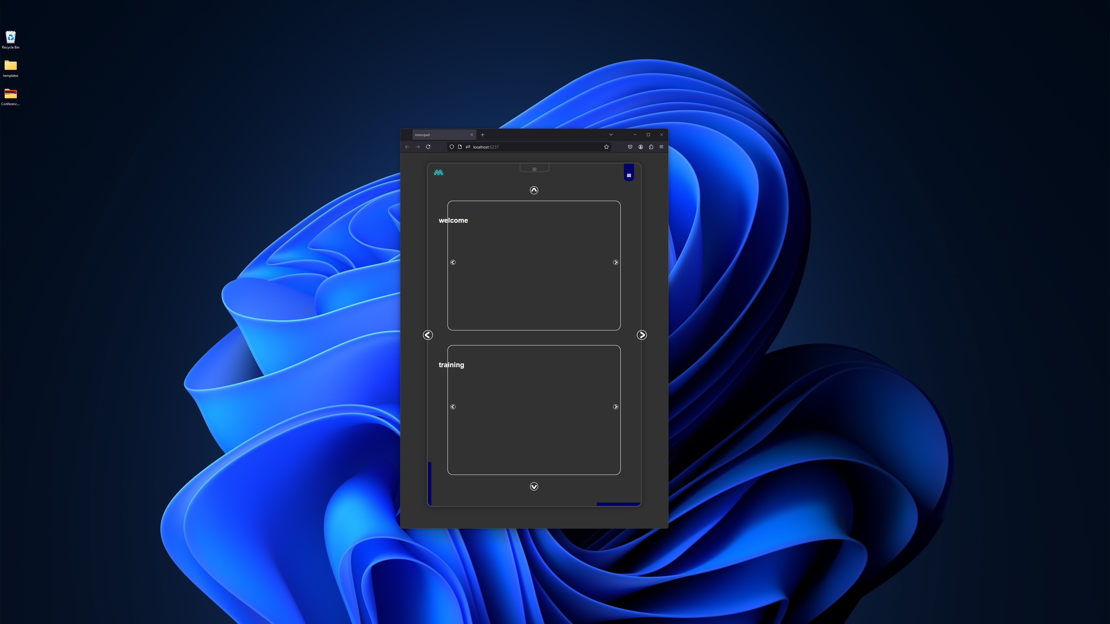
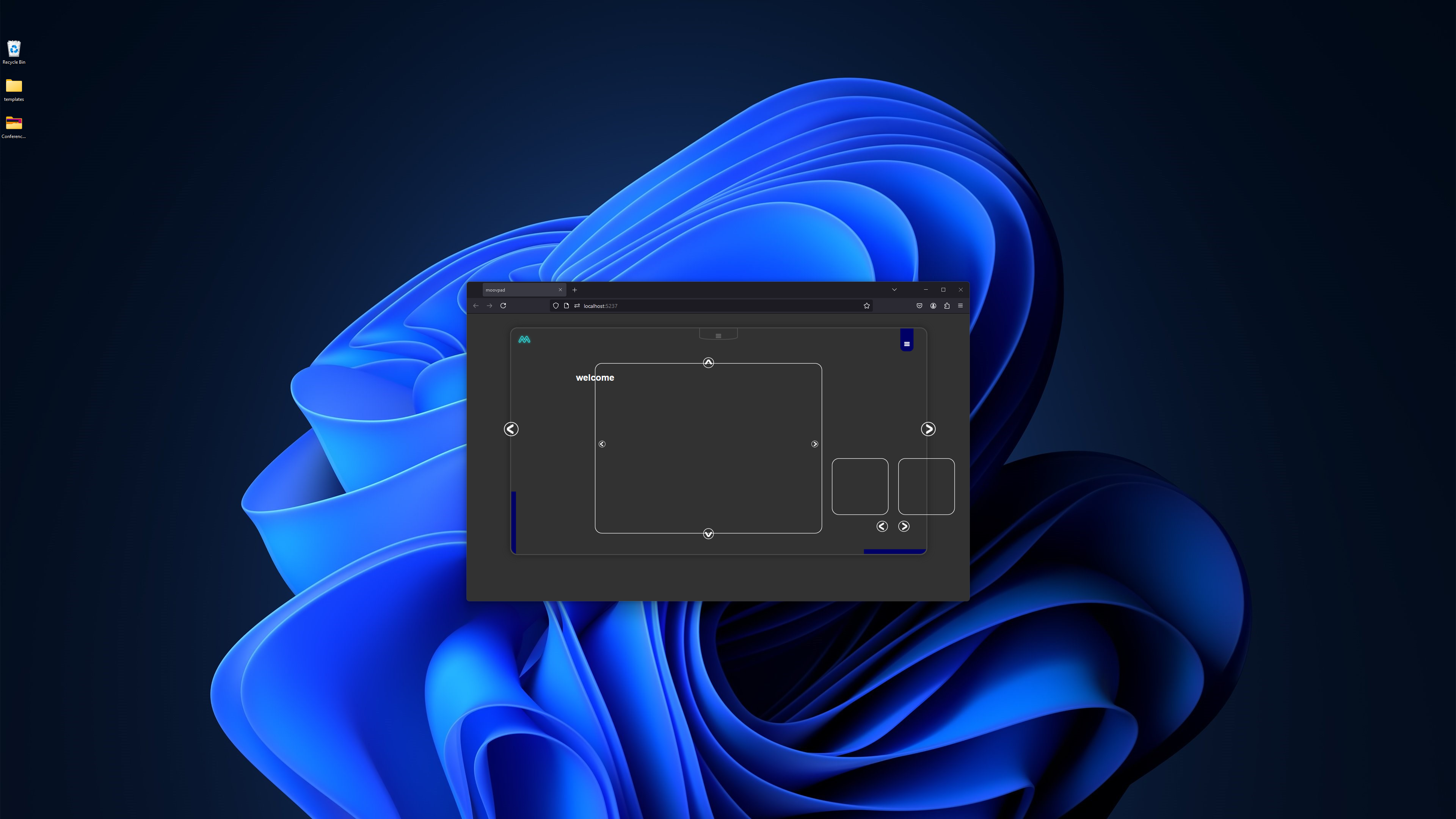
I've started really early today to try and get as much done on the template approaches that will be used for the refactored markup and code. The first two images here show how the different display formats will lead to different mechanics in terms of how users navigate content through the MOOVPAD Web App.
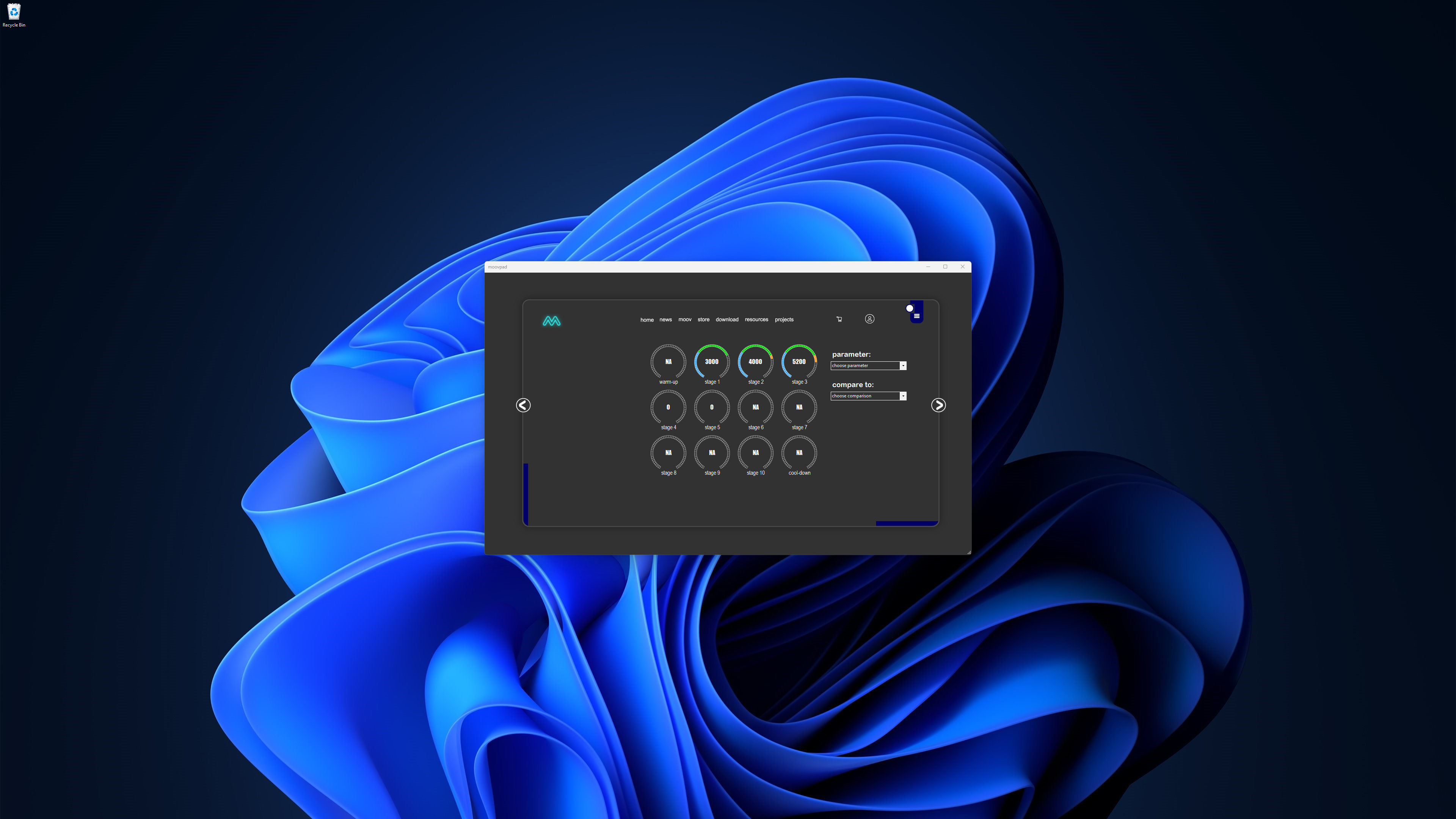
The first screenshot shows the tablet mode. As you can see the navigation of the main content will involve the user scrolling through two separate instances of the content scroller on the same screen, with the scrollers' nav buttons acting accordingly to scroll through and add a new content scroller each time. The screenshot on the left shows the format already seen in the previous version of the online-only app (less the small additional graphic on the left side). The current version switches responsively between the different display formats.


The mobile format for this particular screen still requires more design work to generate the appropriately sized elements. But that will be much easier than UI features and screens like that shown to the left on the desktop (hence why some features will not be available on smaller mobile devices, as they would be too impractical).
More updates soon 🙂
Stay awesome,
EMH
HOW MOOVPAD IS BEING BUILT
For the overview of how MOOVPAD apps are being developed, the reasoning behind particular decisions during development, policies, and more in relation to all the technical things, please see the link to the left.
This will be an ongoing work in progress, and will always be linked to the bottom of each upcoming Blog post.
