Consolidating UI Functions
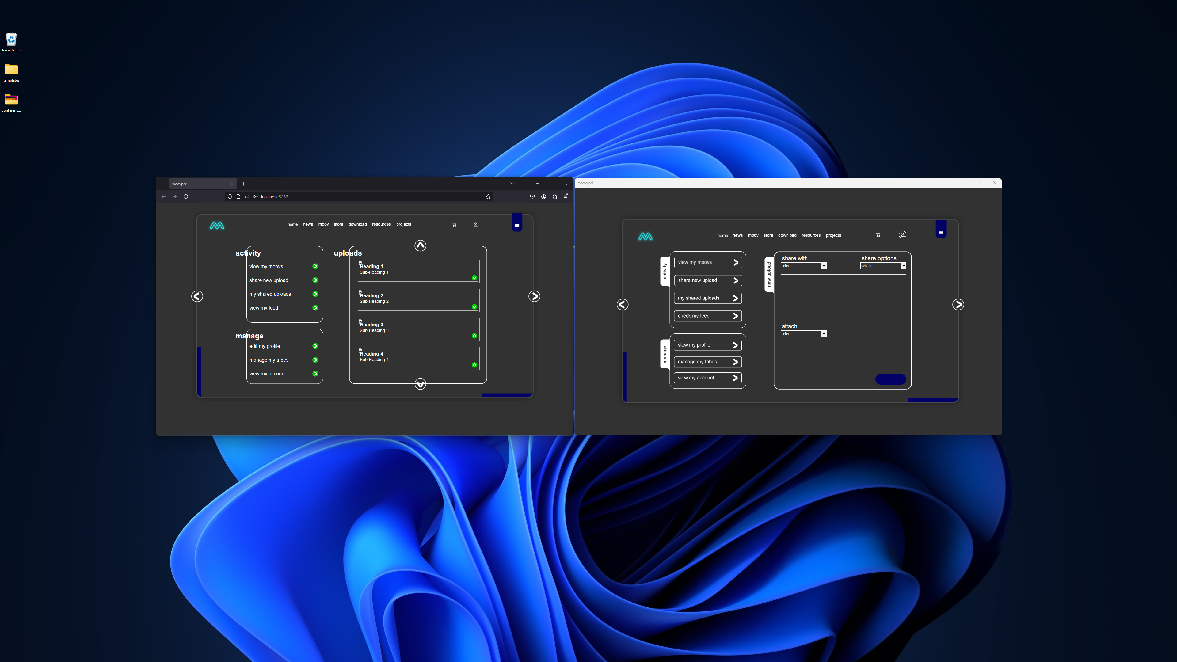
The main focus at the moment for work on the MOOVPAD Web App is aimed at redesigning the previous version of the UI to make use of the new menu options. For example, the context menu (three-dot menu in the upper left, just beneath the logo) allows me to remove some of the selection options that took up too much valuable space on the UI.

The large screenshot above shows a practical example of this, where the selection options on the left are no longer necessary, meaning that some of these functions can be combined into consolidated UI screens.
Because my mind was just tooooo relaxed, ya know? 🙂
Stay awesome,
EMH

HOW MOOVPAD IS BEING BUILT
For the overview of how MOOVPAD apps are being developed, the reasoning behind particular decisions during development, policies, and more in relation to all the technical things, please see the link to the left.
This will be an ongoing work in progress, and will always be linked to the bottom of each upcoming Blog post.
