MOOV Porgram - Tablet Layout
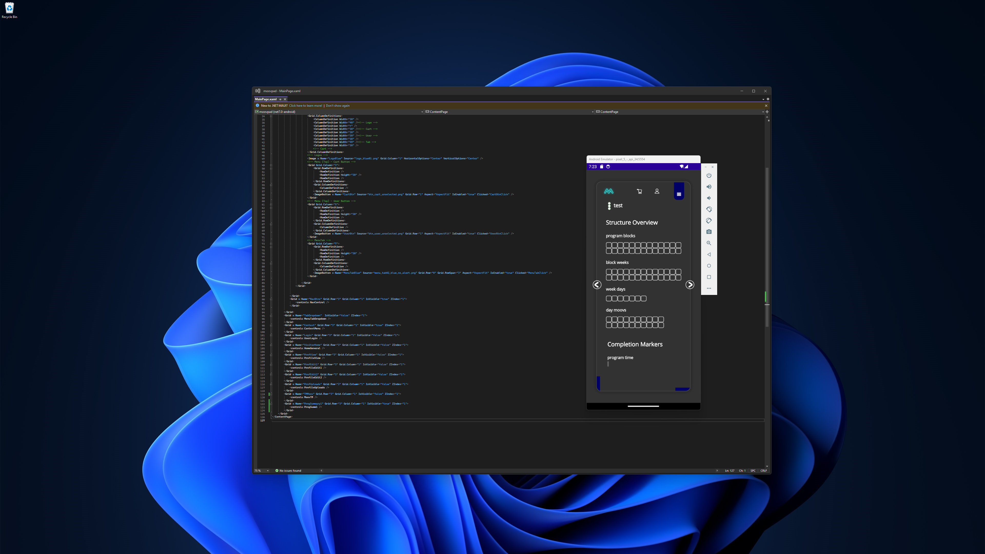
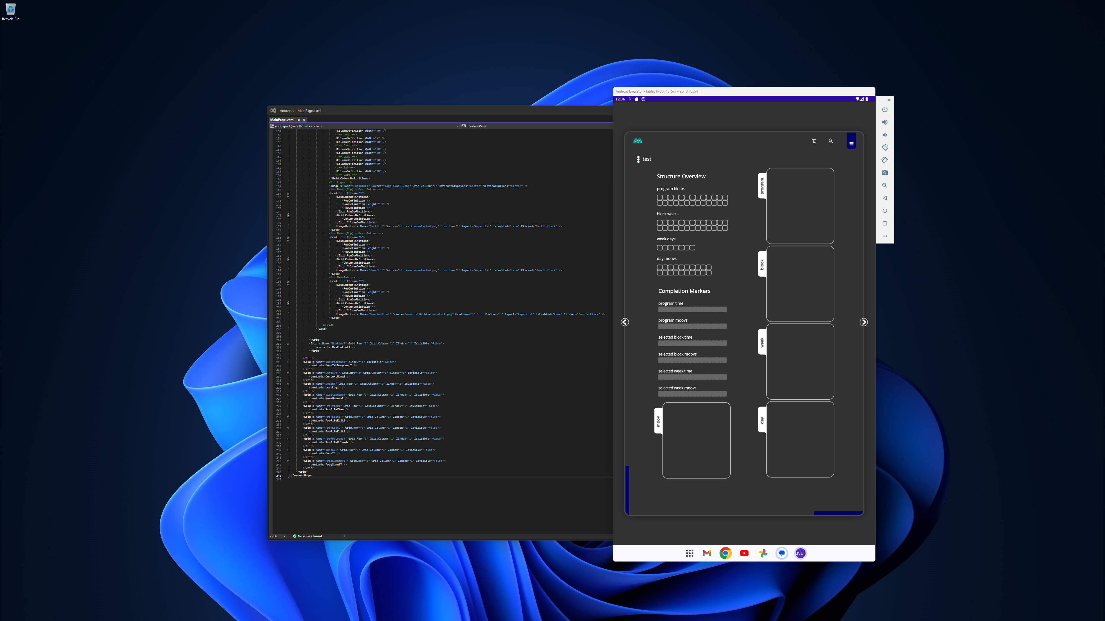
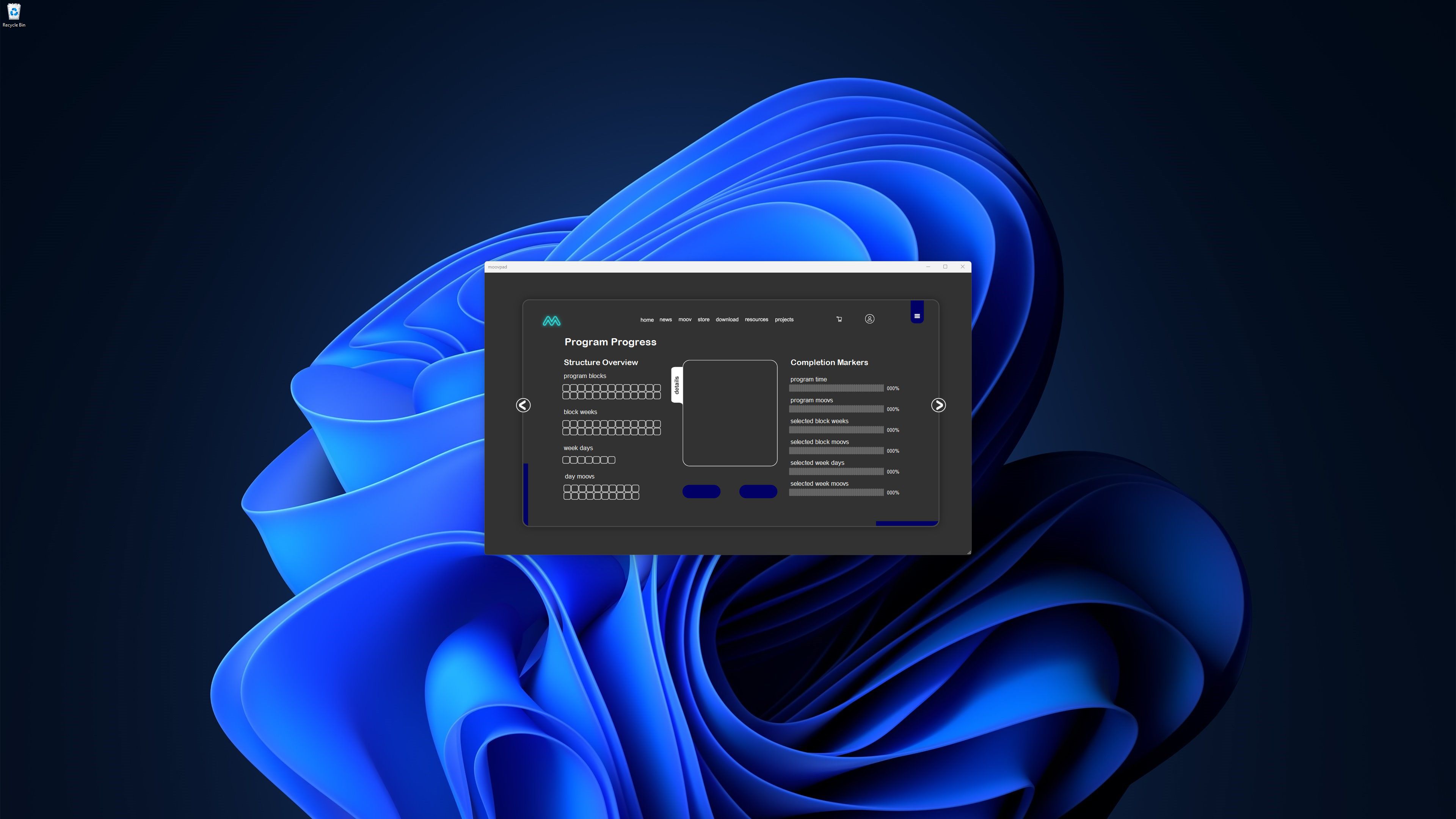
Yesterday, I managed to complete the initial layout of the MOOV program view on tablet devices. While the first screenshot to the left shows the scrollview used on smartphones being restrictive, the new deisgn for tablets allows users to see the information in better detail, and so get a better overview on one screen.

Each format is designed to use an appropriate layout for the tasks most likely to be completed most often on the particular device. And so while users will be able to view their programs on their mobile, they're more likely to use that device during MOOV sessions. The same thing is true for desktop and web versions of the MOOVPAD apps. The good news is this means those tasks can be optimised for on those devices. The bad news is those devices may present some limits to other tasks in some cases. MOOV program planning and review is an example of this.
I now return you to your regular non-insane programming 🙂
Stay awesome,
EMH

HOW MOOVPAD IS BEING BUILT
For the overview of how MOOVPAD apps are being developed, the reasoning behind particular decisions during development, policies, links to the science and research at the core of MOOVPAD, and more in relation to all the technical things, please see the link to the left.
This will be an ongoing work in progress, and will always be linked to the bottom of each upcoming Blog post.
