Viewing Program Metrics
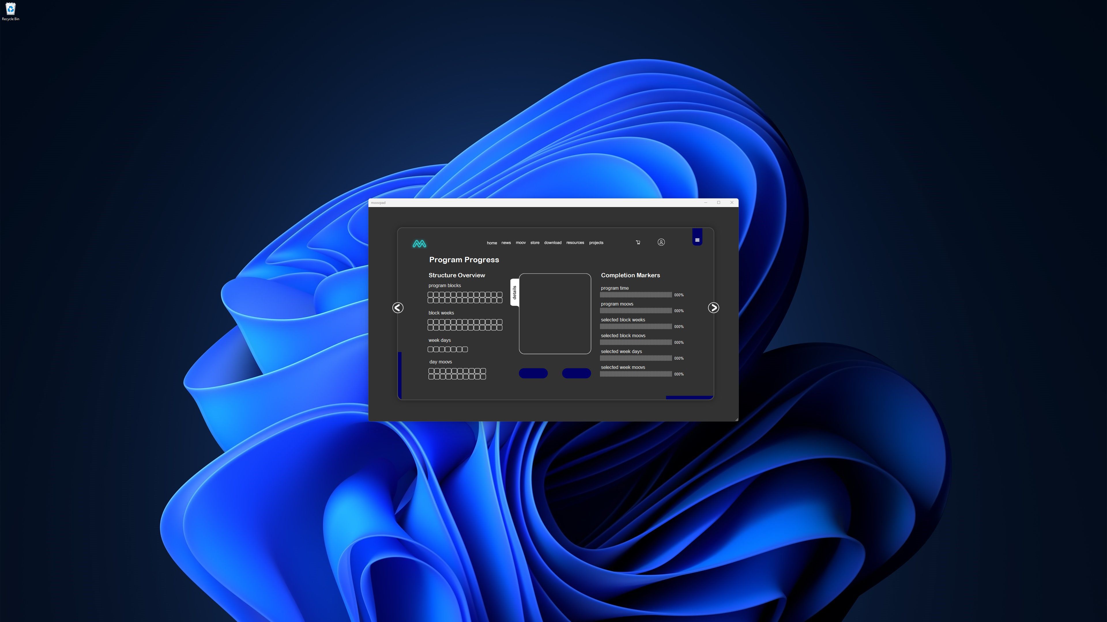
The most obvious limitation of using a smartphone to view MOOVPAD training programs is the smaller screens making it more difficult to navigate complex information. The screenshot to the left shows one example where the MOOVPAD Desktop App can display all of the related information on a simple to understand screen, without scrolling.


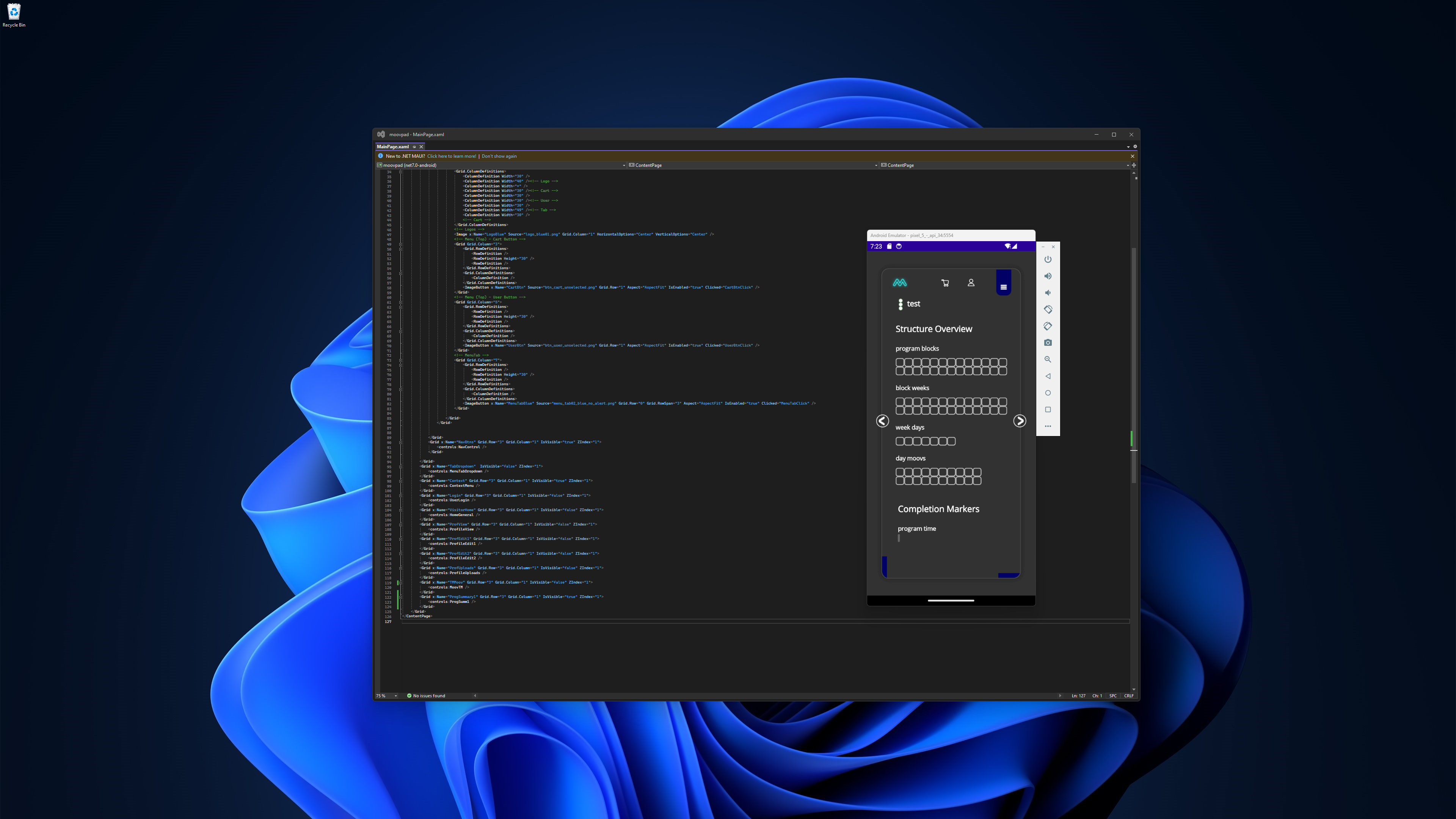
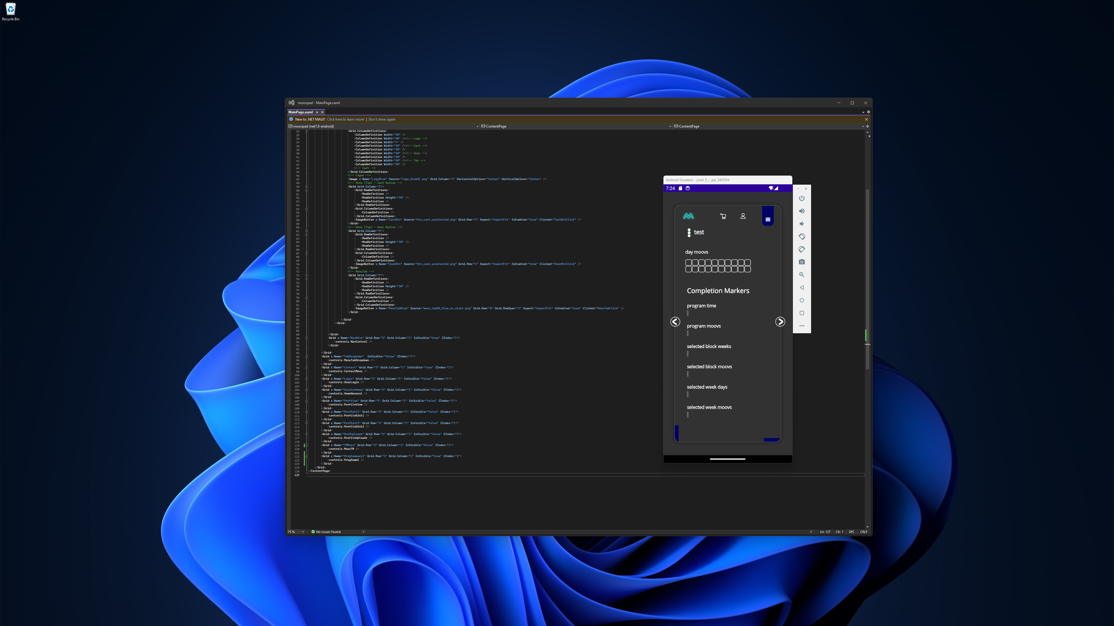
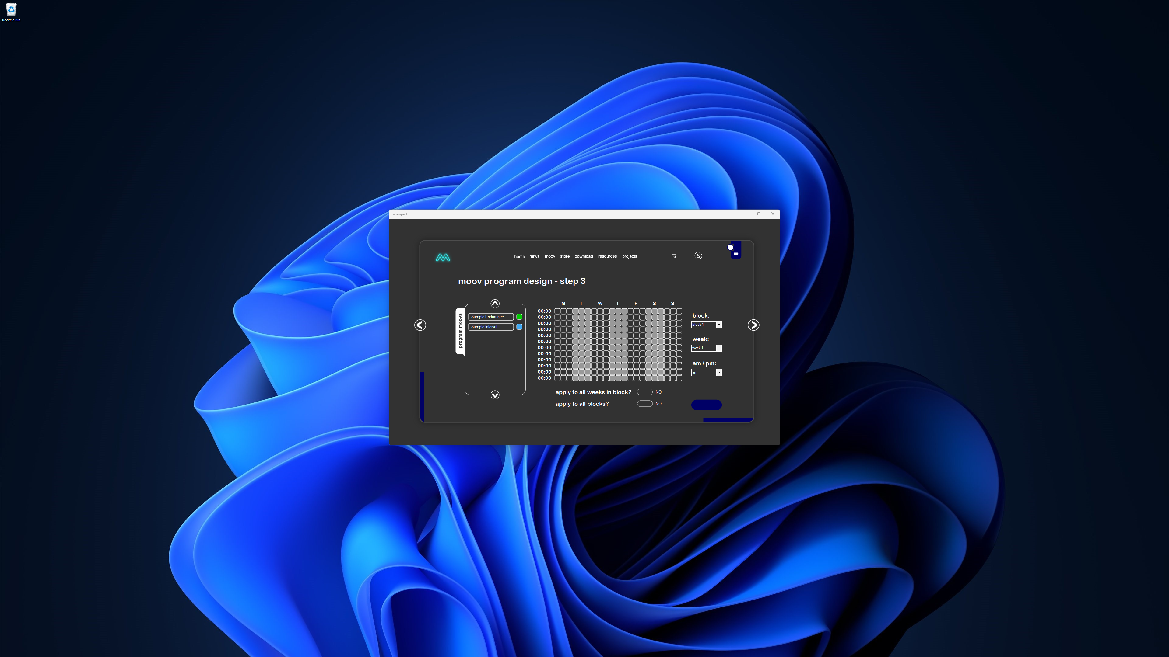
The two MOOVPAD Mobile App screenshots above show the same screen (less the details panel), which can be scrolled vertically to view the information. This makes it harder to select a program block, for example, and view the details below it. I've been thinking of using pop-up panels that can then be closed once the details have been reviewed, but I'll leave that aside for now. The planning of MOOV programs is another area that will require more thought on smartphones. Tablet devices should make these tasks a bit easier.
Hope you guys enjoy the rest of your weekend, and all the very best to you and yours 🙂
Stay awesome,
EMH

HOW MOOVPAD IS BEING BUILT
For the overview of how MOOVPAD apps are being developed, the reasoning behind particular decisions during development, policies, links to the science and research at the core of MOOVPAD, and more in relation to all the technical things, please see the link to the left.
This will be an ongoing work in progress, and will always be linked to the bottom of each upcoming Blog post.
