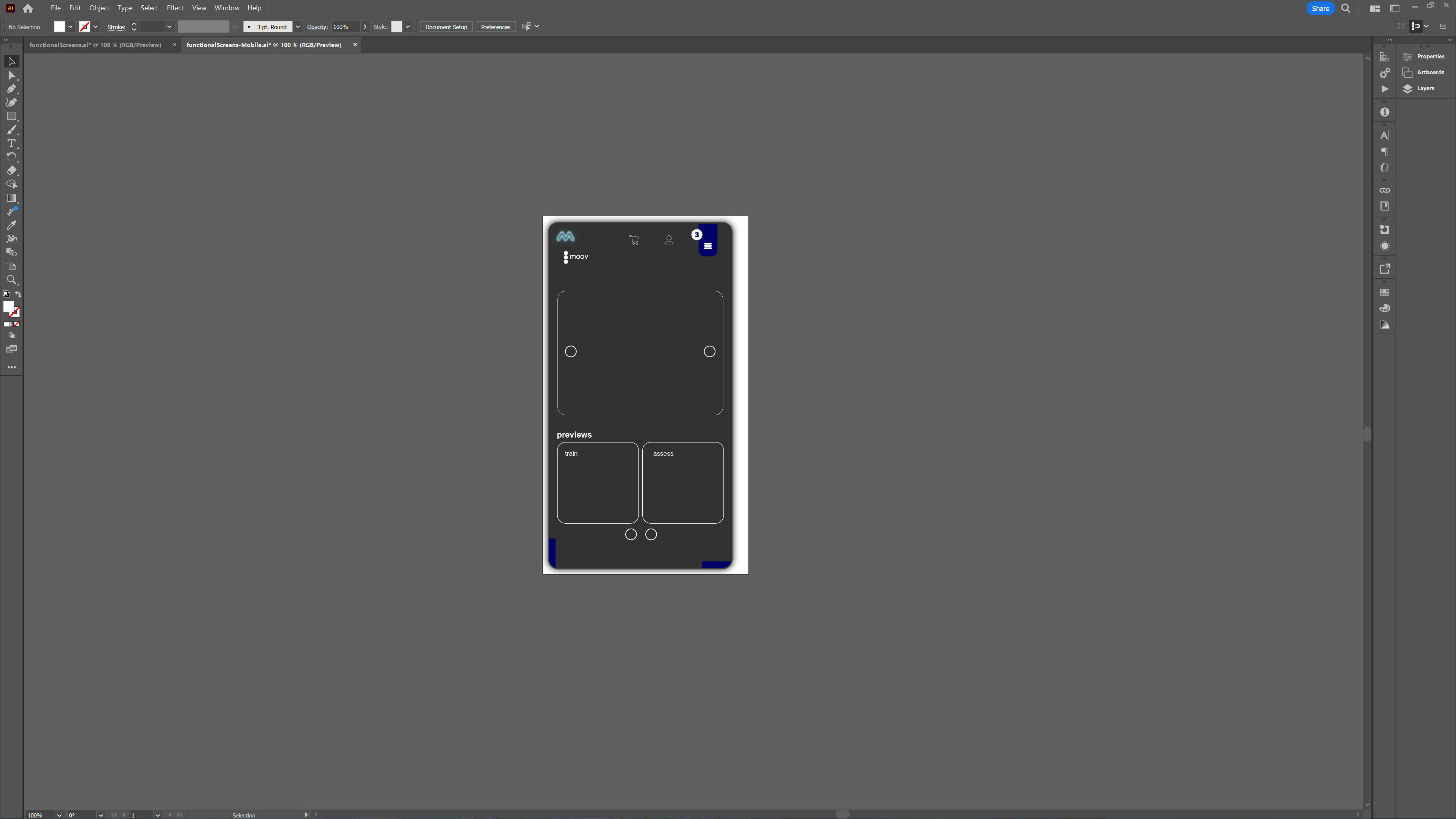
2-Layer Simplified Structure
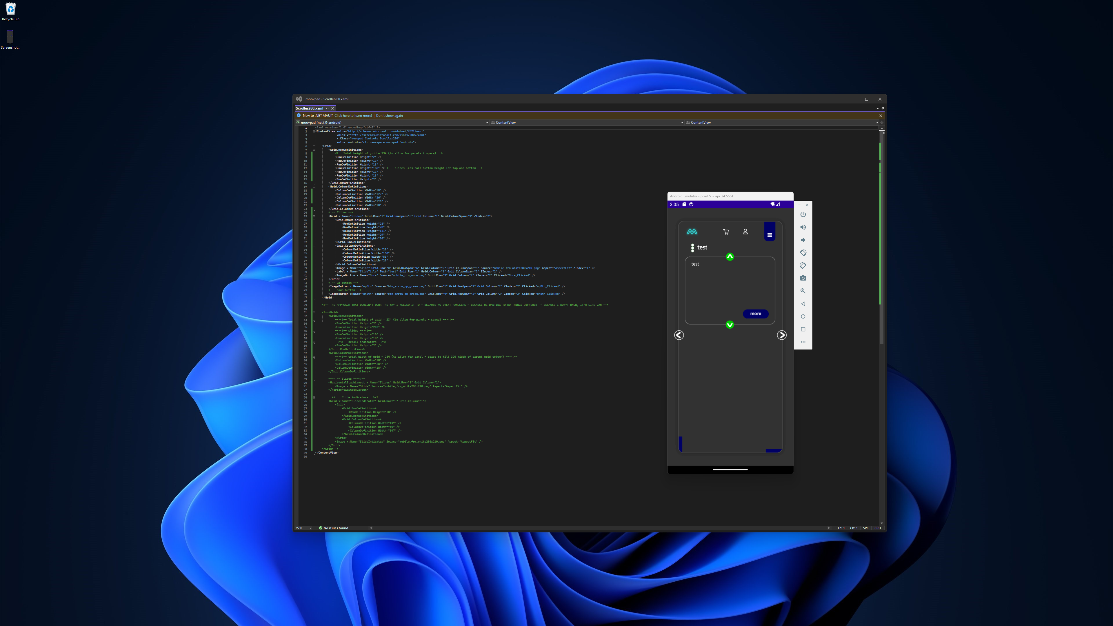
Yesterday I mentioned the use of embedded ContentViews within the second layer of the UI, to separate out different functions within the same control. Last night I was working until the early hours of this morning on a simplified approach in terms of this layer structure. However the normal methods of UI markup in XAML weren't going to provide the right level of event handling. So I balanced the simplified UI layer structure by adding a little bit of complexity to the layout.

The markup highlighted in green (see the larger screenshot above) explains the logic behind my initial approach to this work. However using a HorizontalStackLayout control was wrong because there are no suitable event calls that would allow triggering the handling of the previews and custom scroll indicators, for example. Basically, although I wanted to remove the buttons completely if I could, I couldn't so I didn't 'cos I shouldn't re-invent a perfectly good wheel.
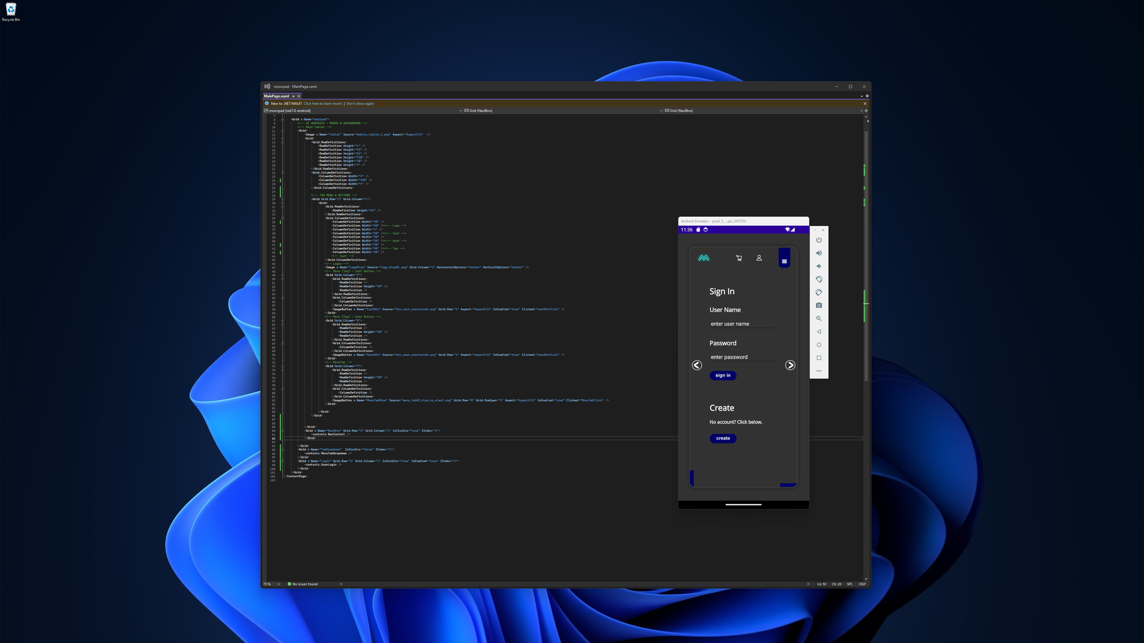
This Scroller280 ContentView is then embedded into the MainPage.xaml ContentPage file just like the UserLogin control was before. The layout for the visitor home screen will be changed to make better use of the space, and the buttons themselves may change a bit, but we now have a functioning UI structure 🙂
Stay awesome,
EMH

HOW MOOVPAD IS BEING BUILT
For the overview of how MOOVPAD apps are being developed, the reasoning behind particular decisions during development, policies, links to the science and research at the core of MOOVPAD, and more in relation to all the technical things, please see the link to the left.
This will be an ongoing work in progress, and will always be linked to the bottom of each upcoming Blog post.
